0
No products in the cart.
No products in the cart.
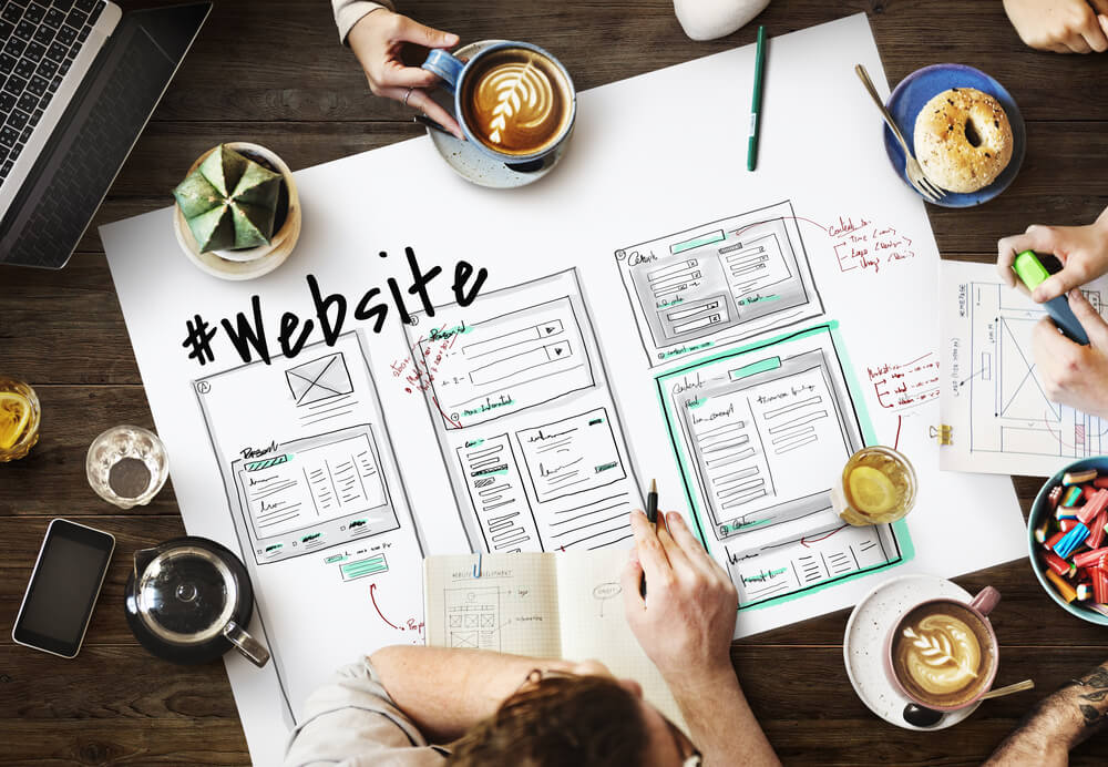
The layout of a web page is one of the most important elements of good design. The layout, which changes the appearance of the page, should be consistent and organized to create a more satisfying user experience.
The layout of a website is defined by its grid. A grid defines the placement of content on a page by dividing it into columns and rows. The number of columns can vary in order to provide flexibility for the designer to rearrange the content when needed without having to manually reformat each individual column.
Layouts are used for the sake of organization. They make it easier to find what you’re looking for and make the website more user-friendly. There are many types of layouts, such as:
.Inline – where all the content in a given row is next to each other but split into columns
.Block – where all the content in a given row is stacked vertically and columns to be read horizontally
.Split – where both inline and block layouts are used on different parts of the page
A layout is the organization and spatial arrangement of a website’s content, which could include text, graphics, video, audio, or other media.
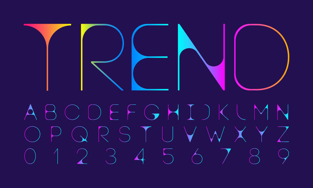
The next element that affects layout is typography. Type can play a role in designing for readability so that visitors can navigate through content easier and faster without getting distracted by extraneous elements on the page.
Typography is a crucial element of web design. It can make or break the branding.
There are two types of typographic layouts – paragraph and column. Paragraph layout arranges the type in lines on a page, while column layout arranges the type across the page in vertical columns.
Typography is an art, which starts with choosing fonts to suit a website’s theme and mood. The most popular font families are sans-serif and serif fonts. While serif fonts are more traditional, sans serif fonts provide more clarity to web users because they have no embellishments that can cause clutter on the screen when printed at a small size or low resolution.
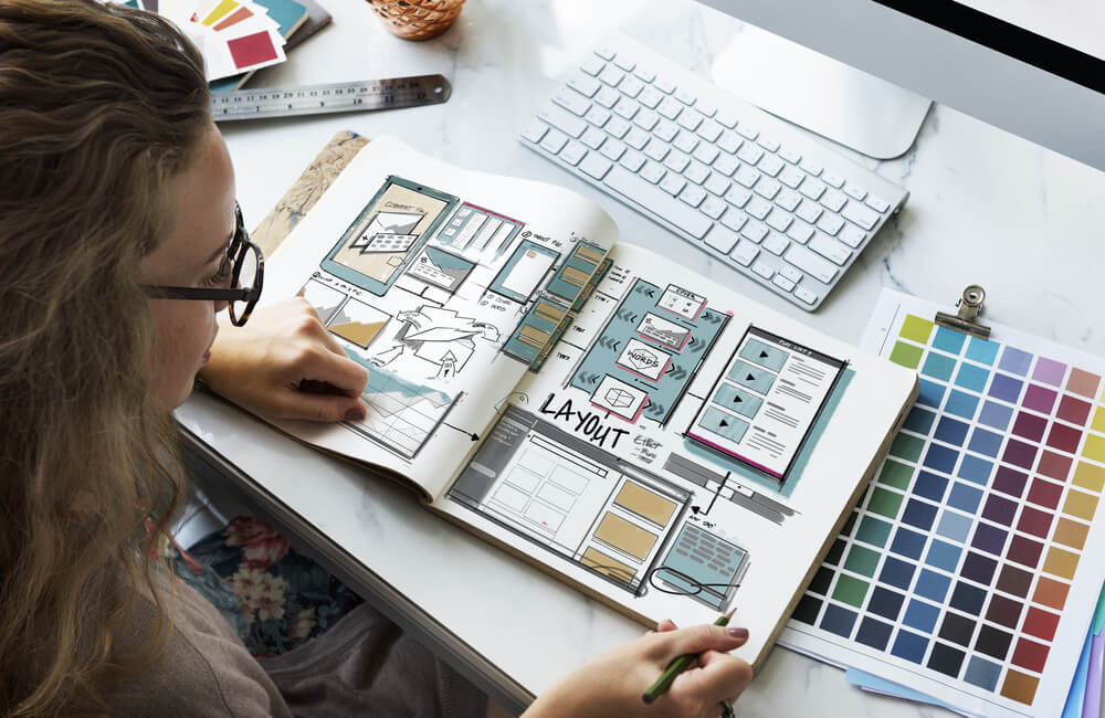
Colors are the most powerful and least expensive way to communicate a message.
Colors evoke emotions and feelings in human beings. We respond to color because the brain processes information is quicker when it is delivered in color. Colors also enhance your mood, making you more productive and creative. Different colors have different connotations, depending on where they are used or what they symbolize.
The right use of colors can lead to better conversion rates, higher engagement rates, and customer satisfaction scores.
There has been a lot of talk about how the colors we use in our designs can affect the moods of the readers. The colors we choose should be in line with what we want people to feel, and the best way to do this is by using emotions as a guide. Many research studies have shown that different colors can have different effects on people.

Contrast is a color scheme that creates a sense of balance and depth. It can be achieved by differentiating two colors with their opposite on the color wheel.
The contrast in this site has red and green as the primary colors with brown as an accent color. It’s used to create a sense of balance because it’s not completely red or green, but instead has both together. The contrast also creates depth because there are two shades of each primary color which allows for more variation in the design.
Contrast is the difference in the color and design that surrounds an area of focus. The contrast will help the user to focus on a specific area of text or images and make it more noticeable.
You can create contrast through color and design. A dark border around a section of text will make it stand out, for example. You can also use contrasting fonts together to make one stand out more than the other.
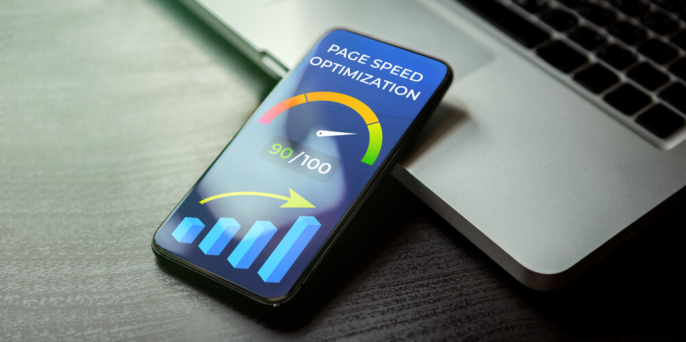
The fastest loading websites give their visitors a pleasant experience, which leads to higher customer satisfaction.
One of the reasons that speed is so important is that it’s the reason why users leave websites. Users believe that slow sites are wasting their time. And when they don’t find what they want on the site, they leave.
If the user has to wait for more than 5 seconds for a page to load, then this will lead to many unhappy customers and low customer satisfaction rates. This is because when webpages have heavy images or videos on them, this will make it harder for pages to load quickly and in turn reduce customer satisfaction rates and increase bounce rates.
Designing websites with a focus on speed has become a very important issue, as it can determine whether a website will rank well in search engines or not. A slow loading website will have a negative impact on the visitor’s experience and Google will penalize them for having too many page load times.
Websites that are optimized for speed end up with an enhanced customer experience, increased conversion rates, and fewer errors. This is why it is important to get professional help when designing your website and make sure to think about its load time.
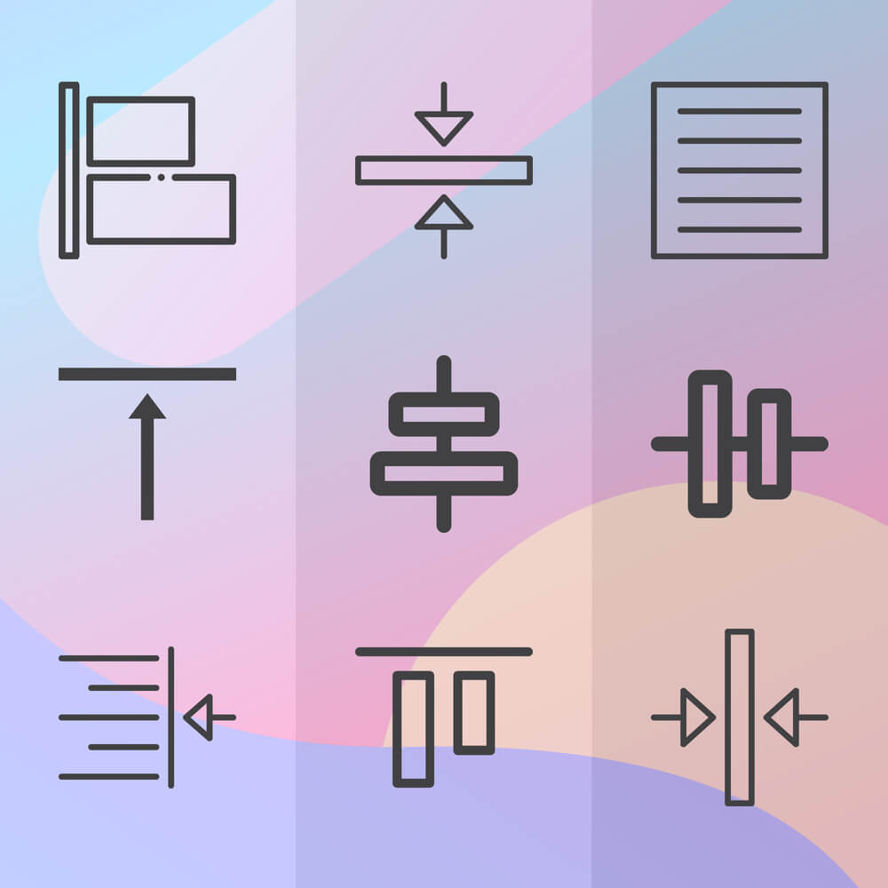
Alignment is crucial for web design because it provides a sense of order to the audience. It is also a way for the designer to guide the user’s eye through the page and keep things tidy.
Good alignment means that all elements are positioned in such a way that they are neat, orderly, and aesthetically pleasing. Achieving this can be difficult, but luckily there are some guidelines and tricks that will help you out in this journey of achieving alignment.
Some elements that need to have good alignment are text boxes, images, tables of data, and images with captions. Bad alignment can make someone’s eyes hurt if it is not done properly or if there’s too much going on on one page.
The alignment of web content needs to be consistent and coherent. Readers want to know where they are in relation to the whole thing, and aligning them will help with that.
The two most common types of alignment are left-aligned text and center-aligned text. Centering a block of text makes it easier for readers to scan the block vertically. Left-aligning a line of text makes it easier for readers to scan the line horizontally.
In some cases, you might center your content horizontally but then have left-aligned lines in an article or right-aligned lines on a webpage layout. This is because different parts of your design will require different types of alignment for maximum readability and clarity.
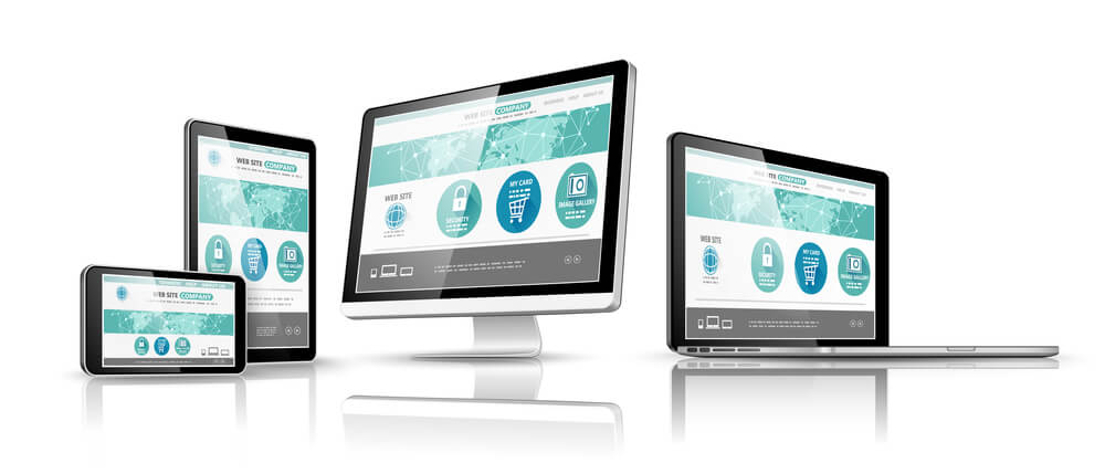
Your website is not going to look good on all screens. That’s why it must be responsive – adjusting to different screen sizes.
When you design your website, you’re not just designing for one type of screen. You need to design for phones, tablets, laptops, and desktops. A responsive website adjusts its layout so that it looks good on any device.
Responsive web design is the best way to make sure that your website appears on all platforms, and it’s easy.
A responsive website is one that responds to the size of your device screen. It automatically adjusts its layout to look great on any device, and will even change the fonts for you based on what size screen you’re viewing it on.
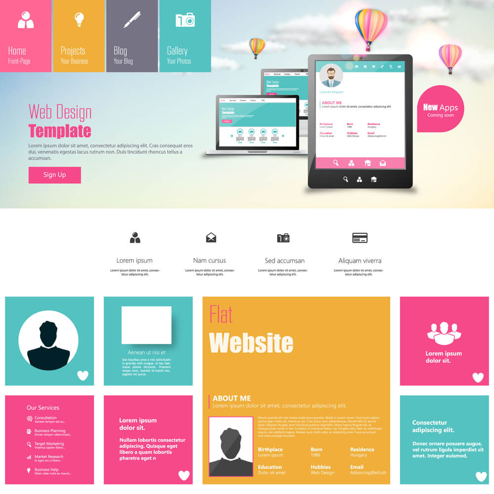
Whitespace is a key element of web design and can be used to create a hierarchy between important content and less important content.
The use of whitespace is an excellent design technique to make the most of your screen space. It allows you to prioritize where the user focuses by using colors, images, and words effectively. Whitespace can help you create aesthetic harmony in your design.
While whitespace should never be overused as it can lead to confusion among users, it’s important not to ignore its power as an essential design element for creating a better user experience.
Whitespace is the space between or around elements of a website. It has many purposes: giving the page a clean and simple look, making navigation easier for users, and helping in the readability of text. Whitespace is also one way designers create balance in their designs.
Whitespace can be used to emphasize specific points on a page or guide viewers’ eyes towards certain parts of the design. It can also be used to separate content and create order in a design project.
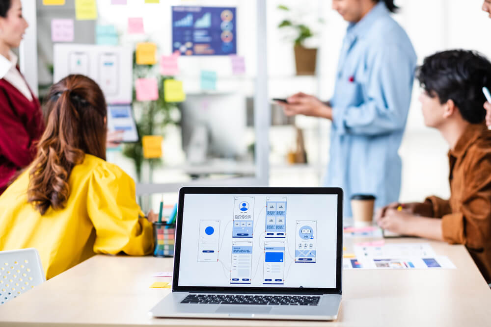
Usability is the degree to which a product can be used by its intended audience. It has been defined as “the ease with which people can use a product or system”.
Usability is a factor that can make or break the success of a website. A user-friendly interface will make sure that the users are able to find what they are looking for easily and quickly.
The best thing about usability is that it’s not complicated. You just need to focus on three main things:
1) creating an easy-to-read layout
2) providing clear instructions in an easily accessible place
3) making sure the website has as little clutter as possible
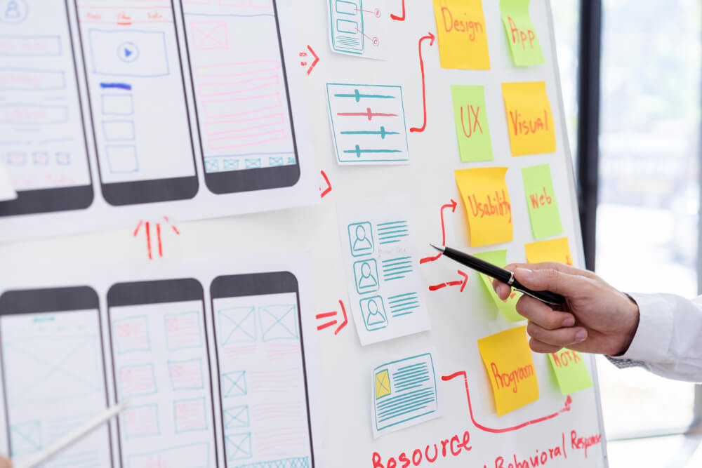
Navigation is a vital part of any website, without navigation, the user would not be able to find what they need quickly and efficiently.
Every website should have a navigation that is both simple and intuitive. The first thing that users should see on your page are the three main sections: Home, About Us and Contact Us.
Each of these three main sections should be self-explanatory. The home section contains all the content that you want to be seen by everyone who visits your site. The about us section contains all the information about your company and how you can help people. And finally, the contact us section provides all your contact information for people who want to reach out to you for any reason.
We are results-driven digital agency committed to giving a valuable experience to Worldwide Clients.
© 2023 — xniux. All Rights Reserved.
| Cookie | Duration | Description |
|---|---|---|
| cookielawinfo-checkbox-analytics | 11 months | This cookie is set by GDPR Cookie Consent plugin. The cookie is used to store the user consent for the cookies in the category "Analytics". |
| cookielawinfo-checkbox-functional | 11 months | The cookie is set by GDPR cookie consent to record the user consent for the cookies in the category "Functional". |
| cookielawinfo-checkbox-necessary | 11 months | This cookie is set by GDPR Cookie Consent plugin. The cookies is used to store the user consent for the cookies in the category "Necessary". |
| cookielawinfo-checkbox-others | 11 months | This cookie is set by GDPR Cookie Consent plugin. The cookie is used to store the user consent for the cookies in the category "Other. |
| cookielawinfo-checkbox-performance | 11 months | This cookie is set by GDPR Cookie Consent plugin. The cookie is used to store the user consent for the cookies in the category "Performance". |
| viewed_cookie_policy | 11 months | The cookie is set by the GDPR Cookie Consent plugin and is used to store whether or not user has consented to the use of cookies. It does not store any personal data. |